Fine Lines 2003Lessons learned at the outer limits of my system Author: Jim Yount Revised: August 03, 2005
Last year, I published a fine lines paper during the Bob Pickard workshop, and published the results here. During that time, I started out using a Letralite, faucet washer, and inkjet printer with consistent line weights at 0.75 point (0.010 inch). During the evaluation, I upgraded the system to include a 1200 dpi true resolution HP laser, vacuum frame, and 1500 psi power washer, and could consistently get line widths at 0.25 point and smaller (more equipment discussion at my website: http://www.graydog.org ). I should qualify that: I could create 0.25 point lines in Illustrator, print them on the laser, and they would image on the resist, and blast on glass. I knew the lines "bloomed" on nearly all printers, but didn't really know or care just how much.
I took this knowledge, and began producing art with fine line raster and vector textures, as a second resist on top of deep carving. You can see one piece here. I was generally pleased with the results, except some of the textures were "clumpy" and more coarse than I would like. It was time to understand more about the limits of the system, before I got really serious about generating more art. I also wanted to create shadows on the deep carved art, by "clearing" the glass using a fine line airbrush. The edge lighting is nice, but I'd also like to do pieces that did not rely on the lighting to build the 3D shape.
From January 2003 through early July, I pushed the limits and finally reached them. In the process, I've figured out solutions to all my questions, and have a clear path forward. I can now design, create, and blast the delicate fabric textures I'd been wanting. The airbrush is performing well, and the clear solvent acrylic is doing its job; now if the operator (me) can gain sufficient skill, I'm in business.
The text that follows describes my discoveries. I'd be pleased to discuss this further with anyone wishing to push the limits.
Test File
Download Illustrator test file test07.ai here. 2000 kB
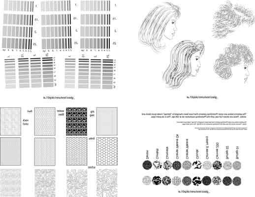
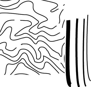
The work came to culmination with the generation of a test file in Illustrator. I've placed a copy of the file here, so that anyone could download it. Some words of caution: I've saved it down to Illustrator 7, but your browser will probably import it as a .ps (postscript) file. Go to Illustrator or Corel Draw, and it should import correctly. Here's a jpeg of the file:
Just a few words of explanation: The upper left hand section contains very fine lines located closer and closer together. I've tilted them slightly, since you'll suffer the "jaggies" on lines slightly off axis. Upper right contains a few of Mary Anne's hairbrushes (vector), with the upper rightmost being a better example, using multistroked lines (fat white line behind thin black one). Lower left contains standard Illustrator vector patterns, at varying magnifications. Line widths range from 0.25 point to 0.10 point and smaller. Lower right has a group of PhotoShop raster textures, and the inverse version above/below. So just how fine are these lines, anyway? Here's a enlargement of the reduced Schist pattern from the Illustrator file (bottom left hand pattern in the file above).
I've added some vertical lines for comparison. They are 0.5 point, 0.25 point, 0.15 point and 0.10 point in size. I would guess the squiggly lines at 0.08 point, or about 0.001 inch.
PositivesMary Anne sent the file to her favorite print shop (thanks, Skip!) for a film positive. At the same time, I printed the file on our HP 5000 laser and on an old 1160 Epson at maximum resolution. Tom Eddleman kindly printed a version on his Epson (3000? with HiRes RIP). I photographed the results using the trusty Intel Microscope at 60x, and reproduced them here.
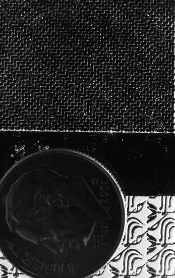
Blasted ResultsSo, how did it work out? Here's a photo where I tried to simulate fabric in the mesh fabric at the top. It looks even better in person; very delicate, and it has a natural uneven look that I really like. The lower piece was a test of the resist's ability to stay put under very very heavy blasting. (It takes some real effort to shove the abrasive down those really skinny lines in the resist.) Yes, that's a dime at the bottom of the picture.
Within Illustrator, I can warp, bulge, curve, deform, and shape the vector pattern so that it would appear to flow over three dimensional shapes. Adding Color:I've been struggling the last year or so, trying to figure out how to add color without overpowering the classic frosted look of carved glass. The picture below is a recent attempt:
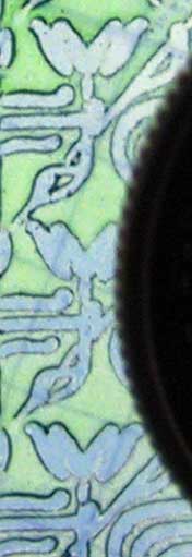
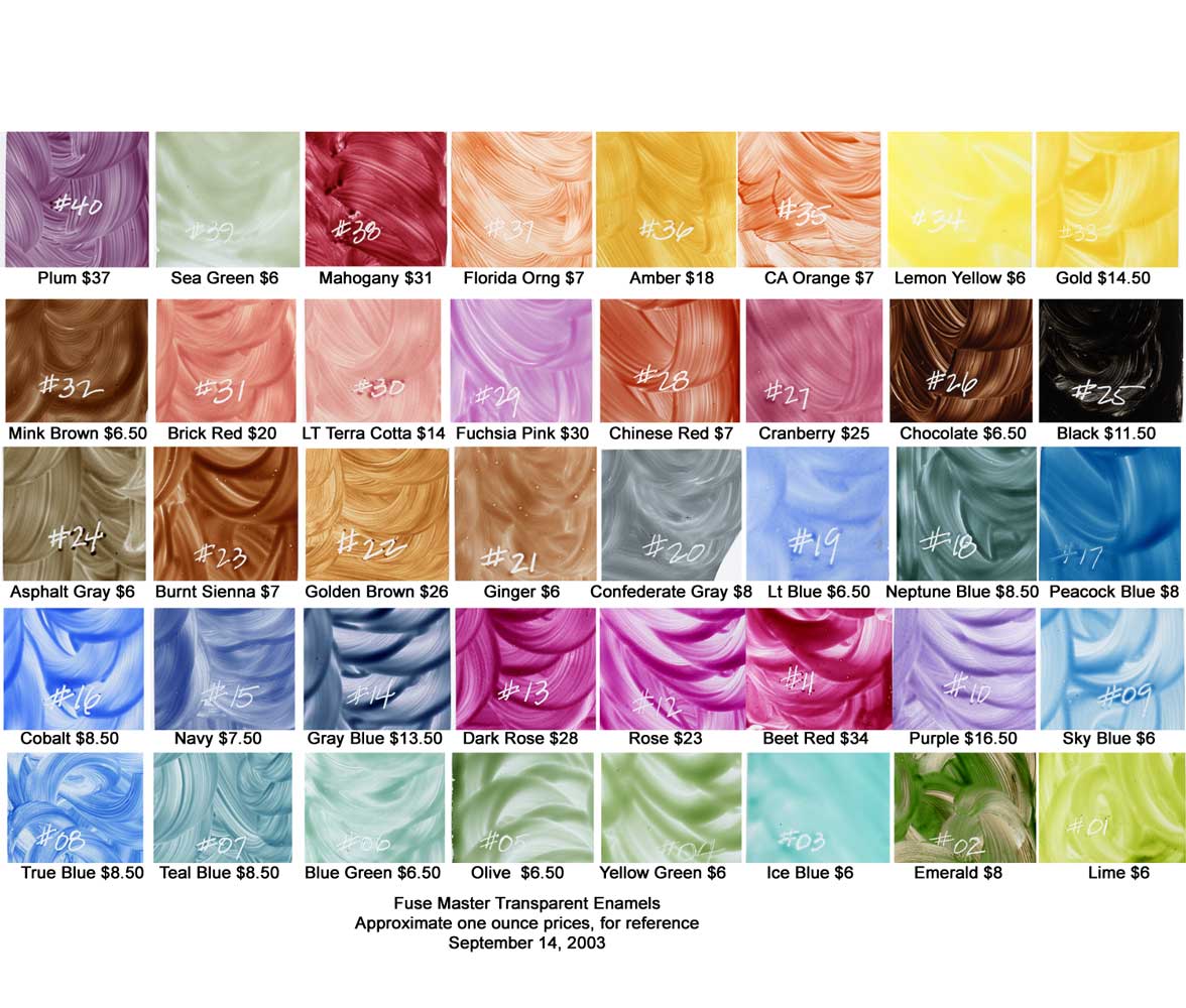
This is a further blow up of the pattern shown above in black and white; my apologies for the picture quality. I hand-held this with the digital camera, with the piece on the light table (the 1/8 inch grid in the background is from the light table cover). I used "Fuse Master" glass enamels from Gil Reynolds' shop in Newberg, Oregon. First, I airbrushed the blue, then fired at 1175. I then blasted the tulip pattern, and sprayed the blasted area with the lime green, while the resist was still in place. I then (very carefully) removed the resist, and refired the piece. Gil and Carmen sell a sample book of 40 2x2 pieces of glass, with brushed colors fired on. The colors shift a bit when fired, so the book is a very good investment if you want to go this way. I need the information electronically, also, so I've scanned the pieces of glass on my film scanner (to ensure accurate color), and created a (147k) file, linked from the thumbnail below. I'll sample these colors in Painter 8 when I design new work, so that I can see the effect before I apply the enamel.
The purpose of the test was to determine the lower size limit for adding transparent colors to designs. I concluded that the enamels were very easy to airbrush, and gave a "painterly" effect at this size. The thin colors, after firing, are quite rugged, but they can be removed with mechanical burnishing with silicone polishers (I use AdvantEdge Silicone Polishers from Rio Grande). While the color worked OK at the size shown, I did NOT have good luck much below this size; the delicate pattern in the previous section didn't consistently let the enamel penetrate well. If you look closely, you can see that the green vertical lines on the blue tulip body are just barely there. Conclusions:1. Using the genuine film positive, I was unable to image lines smaller than 0.25 point on PhotoBrasive's Ultra Pro Blue 4 mil. The printers bloomed the same lines to an extent that they would image on 4 mil. 2. Ultra Pro 3 mil performed amazingly well, imaging nearly everything on the genuine film positive. Problems were when adjacent lines got closer than 0.20 point, when they would tend to run together. The resist was incredibly tough, and survived even my most aggressive blasting on "open" patterns. 3. Nailing the wash time gives the 3 mil wonderful tack. I'm now using the 4 mil for first resist work: stage carving, since it peels so cleanly. I'm using the 3 mil for second resist work since it is more pliable over the previously carved contours, does a better job on the fine lines, and has tremendous tack. 4. I'm using 0.10 point lines where I want some natural variation in a texture, 0.15 for stronger textures, and 0.20 point for continuous textures. These are vector patterns, achieved by taking Illustrator standard patterns (or ones I generate), reducing/scaling the size, and expanding the fill, ungrouping, and selecting the proper stroke. I use Illustrator's "styles" feature a lot in this process. 5. For airbrushing, I'm using an Iwata HPC gravity fed airbrush (absolutely the best - thanks, Tom!), and One Shot clear solvent based acrylic #4005, thinned one to one. 6. I'm still playing with the color, to determine exactly how I'll use the capability. Adding thin, transparent colors does permit the fine detail carving to show much better, without the use of edge lighting. I've sort of skipped over a lot of Illustrator fundamentals here. I've promised to do an on-line "Illustrator for sandcarvers" brain dump here in the near future - aimed at my friends Bob and Alaina who are just starting to do their own vector art after struggling with their plotter software. I'll pace the lesson notes to follow their progress, and anyone else is welcome to join us. Thanks for reading.
Jim
|
|
©2005 Graydog Services • webmaster: jim(at)graydog(dot)org |
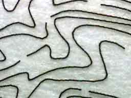 The film
positive, with precise skinny lines, accurately reproduced at about 0.001 inch.
The film
positive, with precise skinny lines, accurately reproduced at about 0.001 inch.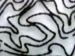 HP 5000 Laser.
Fat, but smooth lines. Blooming is noticeable when you get this small;
almost not measurable at normal sizes.
HP 5000 Laser.
Fat, but smooth lines. Blooming is noticeable when you get this small;
almost not measurable at normal sizes.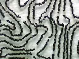 Tom's Epson 3000.
Probably finer lines than the laser, but they are broken.
Tom's Epson 3000.
Probably finer lines than the laser, but they are broken.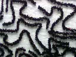 My old Epson
1160.
My old Epson
1160.